
Experiments 1 - 4


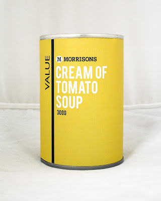
These designs use the vertical line as a colour divider. This design manages to incorporate a good balance of the two brand colours and white, all of the designs feel quite equal. My preference out of the 4 designs is number 1 because:
- The design uses more green than yellow, which I think is a less garish and extreme colour.
- The white type stands out well against the green background.
- The yellow background enables the Value text to stand out,
- The white dividing line is strong between the two.
The white background areas do not work well - they make the design feel much cheaper, whereas the full colour backgrounds enhance the design.
My main issue with this design is that it reminds me of a clown (clowns wear suits that are two colours, divided down the middle). I know that might sound odd, but I find it off putting, and I think that there might just be a little too much going on within the design. (I also hate clowns). I think that something simpler, with less balanced amount of colour will work better. Which brings me onto...
Experiments 5 - 8


These designs are less mixed up and bold, but the designs are still effective and strong. The use of one background colour helps the vertical line to stand out better, and makes it a focus rather than a simple divider. I also think that the line being the same colour as the Value text enables those two elements to be seen as the branding for the range, rather than the line being a separate entity.
Design 7, where the branding and product name are in the same colour does not stand out as much as the other designs, where these elements contrast.
I feel that Design 8 is the strongest because;
- The product name is first in the hierarchy, it stands out from the background, but doesn't have to compete too much with the branding.
- The green background is subtle, but still bold and impacting.
- The use of yellow is minimal, but still very much the focus as the colour of the product name.
- The value branding is simple and clean, the white makes it stand out.
- The smaller type - Morrisons logo and quantity are at the bottom of the hierarchy, but still very clear and effective.
I am going to pursue Design 8 from now on, as I think that this is the strongest option. I will experiment further with the exact layout of all the information and the balance of the design.

No comments:
Post a Comment