Monday 31 May 2010

Invitation...

This is an example of the invitation from the printers. I am pleased with the card stock but not so thrilled with the gloss/foil finish on the front.

The design has been foiled, but you can't really tell. When Chloe and I spoke about it we agreed that we wanted a really high-gloss, high-impact finish for the front. The finish of the foil on this design just doesn't have enough impact. I would say that the finish is more of a 'sheen' than a 'shine'. I realise that black absorbs all of the light, and therefore won't be shiny like a silver or gold metallic, which reflects. I do however think that the design needs more impact. It doesn't feel special at the moment, which is what Chloe and I both wanted. I have suggested a spot UV gloss over the print so that the finish is really shiny. I am not sure what is going to happen at this point, but I am hopeful that we will get something with more impact.

Finished Posters...

I have produced two quite simple but effective posters that complement the finished look-book. I have printed them at A2 scale and photographed them for my presentation boards. I am quite pleased with the outcome, more than one person has mentioned that the style is quite different to what I normal do, so I can only see that as a good thing and a step in a more experimental direction.

Saturday 29 May 2010

Published Adverts...

I have been given two magazines in which the adverts have been placed! Hooray! I got quite excited seeing my work in the magazines and I am pleased with how well the adverts have come out!
These are the adverts from Frieze and the Wetherbys Ladies-Day Programme (weird, but the millinery course exhibit there, so they were nice and asked if we wanted to place an advert).

External Signage...

Organising the designs for the panels that will be attached to the Folly outside the Blenheim Walk building has been a bit of a hoo-ha. Making the designs full size meant that the files were huge (like 4GB) which the printers said the system wouldn't be able to handle. There was a stage of working at quarter size and 1200dpi, but the files were equally as large. Finally we were given the option of producing the artwork at full size, but 75dpi. Chloe and I were equally confused and sceptical as to whether this would work, but I produced the art work and sent it off to the printer.
On friday we were told that the art work was fine, and should print out ok. So, I have now produced the art work for the three remaining panels.

These are all four panels. 1, 2 and 3&4 together.
The panels are designed in order of the most viewed side. 1&2 are seen from the traffic lights and road heading toward the city centre. Side 3 faces the road/traffics lights that runs along side of the college building and side 4 faces the college building (the least useful side!).

Some of the information on the panels is repeated, but everything is there and clearly stated.


Look-Book 5...

Nice new cover...
I have printed a new cover and foiled it - the 'All' is in silver foil and the rest of the print is in shiny black foil. I have also changed the logo on the back cover and made it smaller. It looks more professional now and overall more pleasing. All finished!


And the back....

Friday 28 May 2010

Look-Book 4...

I have reprinted the cover of the look-book. It was suggested in the crit that the logo on the back is too big and should be smaller and more discreet. I have changed the design so that this is the case. I have printed and foiled a new cover; unfortunately the foil moved, and has therefore stuck to the wrong text and ruined the design. I was debating whether to bother trying to foil yet again, but I am going to print a new cover, buy more foil and do it AGAIN!


Posters 2...

I have made some decisions about the poster. I want to keep it really simple and allow the form, shape and colours to do most of the talking. I have incorporated a small amount of written information, but kept it limited so that the image remains the focus.

These are the two posters that I am going to print large scale.

Look-Book 3...

This is a Issuu version of the finished look-book. I am really pleased with the final outcome, as is Gemma. The overall theme is strong and the layout complements the garments, which is really important.


Wednesday 26 May 2010

Posters...

I have decided to produce two posters to complement the look-book. These are for me to get the most out of the brief and to use the strong photographs to the full potential. I have come up with a few ideas and layouts that I am considering using...


Finished Book...

I am quite surprised that I have managed to produce this book in less than 24 hours, but is has been very necessary to work this fast. I have made two copies of the final book, one for Gemma and one for me. The cover has been foiled using black and silver foil onto a smooth grey stock. The pages have been saddle stitched together using thick black thread. I am really pleased with the outcome because the imagery is so strong, and the layout just makes them better and more focused.

I have taken some photos of the spreads and covers for my presentation boards - here are a few:


Look-Book Initial sketches...

These were my initial sketches for the look-book. I threw a few ideas together and moved onto producing them on Indesign very quickly because of the tight deadline. In this case the sketches were useful and gave a good idea of how the images might fit together. However, the layout really comes alive when it is produced on screen and it is much easier to see if the designs are working or not (as shown previously). Anyway, these were my basic scribbles to get an idea of how this look-book could work.

Tuesday 25 May 2010

Stocks...

I showed Gemma two paper stocks when we were discussing the initial ideas for the look book. She was instantly drawn to the textured newsprint stock rather than the matt white stock. I printed some of the spreads and images on both of these stocks to see how the colours would be presented and the overall feel of the design.

1. Newsprint


2. Matt


There isn't a huge difference in the photos, but it is much more obvious in print.

Gemma has chosen the newsprint stock, she liked the texture and the feel it gave the photographs.

Look-Book 2....

I have spent most of today putting together this look book. It feels like it's been quite quick to design and organise, but I have spent a whole day on it. I am not sure if it has been quick or not...
Anyway; I have edited all of the photos Gemma had chosen to go in the book. The majority need small lens spot removing and the floor cleaning. A couple required the removal of underwear lines etc. I have recently learnt a few new tricks to edit photos quicker and more professionally, so I am glad I was able to put these to use. Editing photos isn't really my thing, so I am quite proud that I was able to get it done and to a good standard.

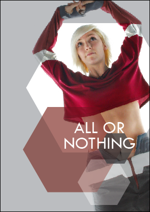
I spent some time messing with the first layout, but Gemma had decided that she wanted to use the three hexagons as crops of the garment alongside a full page image. In a couple of cases we agreed to use the overall hexagon that focused in the centre of the photo. So, I put all of the images in so that they could be appropriately placed and went about including the small print, the contact details, a good number of images that fully explained each look and generally balancing the overall document.

These are the spreads that I have shown Gemma, and we have agreed are strong and suitable to go to print tomorrow:


The cover was originally going to be black with black and silver foiling.


The stock available (shown above) is not suitable for foiling because of its slight texture. So we have decided that a grey cover with black and silver foiling is a more suitable option as it is a much smoother stock and will take the foil better.

Look Book 1...

I agreed to do the layout work for a look book for a fashion student. I have spent just one day putting this together because the deadline for fashion is thursday, and we weren't able to get the photos until today.

The photographer had the images for a week and hadn't edited them. So, Gemma came to me and asked if I would be able to do basic edits on a selection of the images and put them into a 'look-book' style layout for her. She had a clear idea of what she wanted and the way the garments should be presented. It was up to me to come up with a few layout variations and for us to make quick decisions about what was working and what wasn't.

These are the initial ideas/layouts that I produced and showed to Gemma:

These were the ideas that we agreed weren't so good:


And these we agreed should be developed and used in the book:


The motif in Gemma's collection is a six sided polygon (hexagon) which appears in most of the garments. The theme of the look-book needed to fit with the style of the garments, so Gemma requested a clean and simple design that used the hexagon motif in some way.

The ideas I had were in keeping with this theme, and I was able to use the shapes and colours from the collection within the layout design.