Sunday 28 February 2010

Developed ideas 2...

From the 42 developed layouts (from my initial ideas) I have selected these 6 because:
1. They are all clear and show the information well
2. They utilise the brand colours effectively
3. They demonstrate good design, but evoke the 'value' essence


I have mocked up a basic tin and a carton to show how the design would/could be applied

Saturday 27 February 2010

Wrapping Paper...

I have mocked up these three gift wraps, to get an idea of how being the designs need to be, and to see whether the repetition of the designs is working. This top design is really simple; the lines of hearts alternate in colour, pale pink and red against white. The simplicity works well; it isn't over the top, but understated and soft.


This design is more detailed; the first covering the entire print area is quite imposing and interesting, but not over the top because the style of type allows the design to remain simple and uncluttered. The repeated hearts design ties in with the card that uses the same design; the wrap is not as impacting because of the amount of white space around the shapes, but there is something quite nice about it. The heart design might work better on a gift bag, with the full printed wrap as a complement.


Cards...

I have chosen these two card designs because they are working best from all of the development I have produced. The designs use the same material, but differ quite a lot in their aesthetic and execution.

1. This design is clear, simple and quite subtle. The type has been styled into a shape and the pairs are easy to read and pick out from the design. I like this design because it isn't sappy or too lovey and over the top. It is friendly and expressive, without using a slogan or sentimental phrase.


2. This design is more focused on the paper folding aspect of the overall design. The type is simple, but has personality and the small line of hearts connects all of the pairs together. I like this design because it interacts a little more with the user and is more exciting than just a normal card.

Developed ideas 1...

I chose 7 of my initial designs to develop further. I produced 5 further variations of each design; these focused on colour, layout, information and type. I wanted to create this many design options so that I could pick elements from each that are working well and bring these together to create a very strong final design.


Friday 26 February 2010

Proposal development...

We looked at the developed ideas and have chosen 6 that are similar in ways, but each have something quite individual about them. We have divided up the designs so that we each have two to finish for a session with one of our tutors next week, where we will reduce the number to submit to the fashion team. I have been working on the full colour and black and white 'Top Line' designs, and these are the finished proposal pieces. The information on these spreads is not current - the names and images are from the previous graduating year to give a fairly clear idea of what the designs will look like; a different name and set of images have been used on each spread to give the client and idea of how different images would be shown.


Developed ideas...

After considering the initial design layouts we had all come up with individually we talked through what was and wasn't working and what we were going to develop. These are a selection of the developments that I came up with.

1. These two layouts are intentionally very low key in colour. The images are intended to stand out against the monochrome background and be the focal point of the design. The top design uses small and limited type, using a decorative type face for the designers name. The overall design is strong, and working well as an overall spread. The black background on the full image page helps it stand out and makes the image pop.
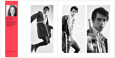
The second design uses a coloured band across the top of the page, and shows a picture of the designer (suitable for a 'yearbook'). The full bleed image is very imposing and strong - it is a great focal point for the spread and uses the full available space.


2. These spreads utilise the coloured horizontal band, which contains the designers name and contact details, which are a little hard to pick out in the overall design. The option of a full colour or greyscale with a spot colour both work well with this layout as it allows the images to take the focus, but still feels clean and informative. In the case of the full colour spread, the colour for the band is taken from the image and would be different for every single spread, creating a personal and individual effect.


3. These designs use the coloured band across the top of the spread, which contains the designers name and contact information. In comparison to the similar designs above the the designers name is in uppercase and in a much larger point size, which makes it easier to pick out from the overall spread. Both of these spreads are strong, and are working better than the similar one above.

Fashion Yearbook Initial Spreads...

Emma, Sara and I sat down together and came up with 2 design themes for the Fashion Yearbook. The brief from the fashion team is to keep the design sophisticated and uncluttered; so we came up with one idea that was based on block shapes, spot colours, clean lines and strong images. The second is more editorial; using bold headings and decorative type, keeping the images as the focal point and the rest of the design very minimalist.

These are my initial spread ideas for each theme:
1. 'Sans Serif'


The spot colours have been chosen to represent Pathway A (Fashion and Innovation) and Pathway B (Fashion and Design).

2. 'Serif'

Thursday 25 February 2010

Initial development...

After producing my initial design ideas and creating digital developments of these; I have decided to develop these seven options further. These seven designs all have elements that are working in a way, but need developing to create a more engaging and suitable design. The information that is included on the labels needs to be to the point and probably quite minimal. The use of the Value logo is very important and it needs to be an integrated part of the design. The use of the green and yellow colours has to remain as these are the brand colours, and part of the current identity. I want to create a colour combination that complements the design, makes it eye catching and remains within the brand identity. I feel that there are elements within all of these designs that could work well as part of the final design.

Developed cover ideas...

These are three of the cover ideas that I have been developing. This top design uses linking lines to connect the title, author and blurb together. I am not that enamoured with this design, as it doesn't express the themes of the story well enough. I think that the inclusion of colours may help, but I think the design is lacking expression overall.


This design is more traditional - the cut corners are meant to resemble labels tucked into a backing paper. It is interesting, and sort of has a 19th Century feel to it, but I think that the theme of the story is totally lost and the book looks like it has no emotion. This is a design I will not be developing further, it is too dull.


These designs have stemmed from a hand drawn initiative. I think that the contrasts between the hand drawn and digital type works well and gives the titles personality. The Kipps design is an altered digital type face, the extended descenders on the Ps is designed to represent how Kipps doesn't fit into the life mapped out for him. The Love and Mr Lewisham design is a juxtaposition of the expressive love and the straight and uptight Mr.Lewisham. Finally the history of Mr Polly is designed to represent the quirkiness of Mr Polly and the dull and mundane life style that he has. I am pleased with the initial ideas for these designs, I think that they have some milage in them, and could create modern and engaging cover designs.