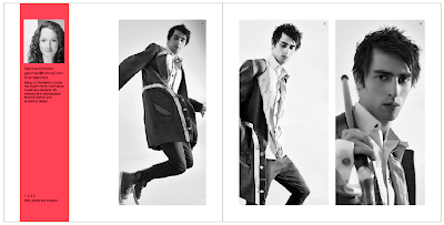
Emma, Sara and I sat down together and came up with 2 design themes for the Fashion Yearbook. The brief from the fashion team is to keep the design sophisticated and uncluttered; so we came up with one idea that was based on block shapes, spot colours, clean lines and strong images. The second is more editorial; using bold headings and decorative type, keeping the images as the focal point and the rest of the design very minimalist.
These are my initial spread ideas for each theme:
1. 'Sans Serif'


The spot colours have been chosen to represent Pathway A (Fashion and Innovation) and Pathway B (Fashion and Design).
2. 'Serif'


No comments:
Post a Comment