Friday, 30 April 2010

Post Tutorial Plan...

I've had a tutorial with Fred this morning and we have discussed pretty much everything that I am doing to finish off this module. We discussed the new brief I have written (Tea) and decided that I should focus on just one of the audiences, rather than two. I am going to spend next week finishing all of the other briefs I have been working on up until now, and then go back to working on the Tea brief. This will give me time to consider whether I can give enough time to the brief, and therefore tailor it to the time I have left to complete it.

I have a time plan for the weeks up until the deadline, and a plan for the briefs and elements of each that I need to focus on up until then. I feel quite prepared for the next stage of this module, and will be working hard to make sure that I achieve all I can in the time I have left.

Building Blocks...

This is my initial idea for a package that looks like building blocks. I have sourced a net that creates a box, but is totally flat when unfolded. My intention would be to have the tea in a bag inside the box, for freshness, and print further information about the product and it's health benefits on the inside of the box.


Thursday, 29 April 2010

Character Ideas...

I want to characterise my packaging for children's tea, to give it an appealing and fun personality. I am currently thinking fruit, as this represents the actual product. These are my initial vector developments from hand drawn sketches...


This style of illustration is quite simple, and emphasises the sweet and fun nature of the product. I feel that I could develop these illustration, but I am not sure if I would prefer to follow a different route with the characterisation.

Monday, 26 April 2010

Bazaar Postcard...

These are my initial ideas for the Bazaar promotional postcard. I want this design to be really bright and eye-catching and incorporate some of the names that the brand will showcase. I think that one of these design will form the basis of the final postcard. I currently like the second Bazaar logo design best; I realise it is busy and bright, but I think that this works and is appropriate for the design.


Finished Products...

I have finished the designs are ALL these Morrisons Value products. I looked a bit weird buying this really random range of products, but they have all served their purpose well. I am pleased with the final outcomes and the print finish is pretty much perfect. I am going to photograph these products so that I can put product shots on my final boards, rather than handing in all these separate products.


Colour Decisions...

We have been waiting on a decision regarding the colours that we are going to use within the yearbook. Because there are only going to be 2 colours and black and white imagery, the colours need to be really spot on. We have given Sue several options that we thing could work really well, and have been waiting for her to make her final decision.

We have been to speak to them regarding the colour, and used Pantone swatches to make sure that we get the right colour on paper, rat
her than from screen (which won't be the same at the printers). So have disregarded the option of matt paper, because the colours we are considering do not show well on the matt stock (which is more absorbent). We made the decision to use satin paper throughout the book and to use a strong sunshine yellow and a raspberry
pink as the colours. The colours are very bold, and will contrast well against the black and white photography, and stand out from each other because they are so different. We are happy with the choices an can now make further decisions regarding the rest of the layout of the book.

Sunday, 25 April 2010

Fashion Information...

We have been collating the information for all of the fashion students. We asked them to bring the information to the first photoshoot, but not everyone turned up or was able to bring all the information we asked for. We are hoping to get more information via email over Easter so that we can start to move forward with the book design.

We have asked for:

1. Full professional name (To clarify spelling or shortenings)

2. E-mail address (a professional address and non-university address - you can set one up with google or hotmail for free)

3. Website address (if you have one or are in the process of creating one, please make sure the address is correct - if you are not intending on making a website please let us know, so that we can exclude this information )
4. Telephone number (mobile is fine!)

5. Your collection title (Please decide on one asap)

6. A short paragraph about you as a designer and your collection (this should be short and to the point)

End of Year Show Adverts...

I met with Chloe on Thursday to discuss the direction in which the designs for the end of year show were heading. We bounced around a few ideas and have settled on the formats and general information that is going on the materials.

The college is taking out adverts in three arts magazines; Frieze, The Drum and Creative Review. I need to produced the designs for each of these by next Thursday (29th April) so that they can be sent to the magazines ready for publishing.

I have put together some initial ideas, that I have sent over to the marketing team for some feedback and I will make the necessary developments to next week before Thursday.

These long landscape designs are for Creative Review. Half Page:


These smaller designs are for Frieze and The Drum. Quarter Page:

Friday, 23 April 2010

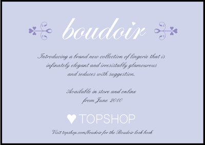
Boudoir Postcards 2...

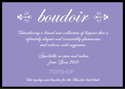
I felt that this design (below) had the best type for the body copy. It is quite bold and therefore easy to read, but it is also very elegant and feminine. I have experimented further with this type face to find a design that works well for the postcard...


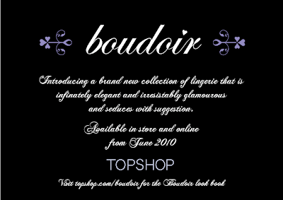
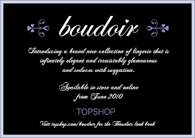
Further designs...


I prefer the black or white backgrounds. Black is not one of the colours I have used within the branding, so it could be useful here to make the other colours stand out better. I am going to print these designs to help me decide which has most impact.

Boudoir Pro-mo Postcard...

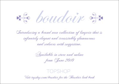
These are my initial ideas for the Boudoir postcard. I want all of the information to be on one side of the card for this design; as the logo is more elegant and soft I think it might look a little blank if it were on one side alone. I have put together some body copy after looking at descriptions from La Perla, Elle Macpherson Initmates and Agent Provocateur. I want this postcard to remain very elegant and feminine.


Home Pro-mo Postcard...

I am designing a simple promotional postcard for each new brand. Topshop usually have postcards or leaflets at their tills to draw attention to new ranges or collections, discounts etc, so I think a promotional postcard is suitable and will fit in well with what they already do.

I am intending on producing the Home postcard in the shape of the house used on the tags. I think that this will make the postcard more interesting and people will be more likely to pick it up and have a look. These are my initial ideas for the front of the postcard (simple coloured house log0) and for the information on the reverse.


I like the notion of putting the type at an angle, but I am not sure if it is too off kilter and might be difficult to read. My preferred reverse design is the third image; it uses two typefaces plus the Topshop logo - I think that keeping it simple but bright and fun it probably the best option. I will look into what colour combinations I am going to use etc.

Oops!

I have just realised that I have been spelling the word Bazaar wrong! Thankfully I have noticed before I made any of the final pieces, so I can easily change the design. This is the final tag design; the repeated Topshop pattern is going on the reverse of the tag, and then product information will be printed on a sticker to be stuck to the back of the tag.


Bazzar Tags...

I had made some decisions about the style of the Bazzar clothing tags. I had decided on a colour scheme, and I wanted to try printing onto a buff sugar paper. I have experimented with this and the result is shown below. I am unhappy with this for two reasons:
1. The buff paper makes the whole design feel more drab and dull
2. The colours do not stand out nearly as well, and the colour range I have chosen is not as eye-catching as the previous colours I was working with. I have tried the colours on white paper (shown on the left) but I still think that they are not strong enough.

So...
I am going to produce the label in brighter colours and on a pure white stock so that they really pop. The tags below are rather thick (approx 3mm). I want to make my final tags about 2mm thick so that they are substantial and strong.


Thursday, 22 April 2010

Canvas Bags...

I decided quite early on when I started designing this brand that I wanted to use a canvas bag as the carrier bag. I think that the aesthetics of it work well with the brand values (eclecticism, vintage etc) and I like that it is reusable. I think that a reusable bag from a cool high-street brand is more likely to be used by a young and trend aware audience than a reusable bag from say Sainsburys or Boots.

These are my ideas for the bag design. I want to keep it quite plain and simple, to allow the logo and colours to stand out. My preferred design is the top left of the small bags. I like the set up of the logo and Topshop name. It seems to be lost in the other designs, and I really think that the bag design needs it to give it some context.

I am going to produce the bag design by using an iron on transfer. I considered screen printing the design, but this would be a lot of effort and time for just a one off piece for my final photos.

Friday, 16 April 2010

Bazzar Mock-up...

I have made some headway with the development of the Bazzar branding. This is my favourite design because the type is so strong and eye-catching. Mocking-up this design has helped me to see how it will appear when it is attached to a garment. I have produced a couple of designs that have TOPSHOP reversed out of the type, which works quite well and enhances the brand.

Boudoir Mock-ups...

I have produced a few mock-ups of a range of labels of the Boudoir brand. I want to see how effective the designs would be when printed and attached to a garment. I have discovered a few flaws in the designs, which I will address and improve.


Some of these labels are too large for the type of garment they will be attached to. The simpler designs are working better, and the soft colours are chic and sophisticated. I am tempted to add foil blocking to part of the design, but it may be overly shiny. The shaped label is really interesting, and captures a more fun element to the brand. Printing the design and then having it laser cut will be tricky, so I think that an overly decorative shape won't work. This tag does not need to be double layered, I think that it may be too much because the tags actually need to be quite small. Using a velum overlay may work well, so I will experiment with using this option.