Friday 23 April 2010

Boudoir Postcards 2...

I felt that this design (below) had the best type for the body copy. It is quite bold and therefore easy to read, but it is also very elegant and feminine. I have experimented further with this type face to find a design that works well for the postcard...


Further designs...


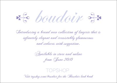
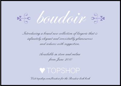
I prefer the black or white backgrounds. Black is not one of the colours I have used within the branding, so it could be useful here to make the other colours stand out better. I am going to print these designs to help me decide which has most impact.

No comments:

Post a Comment