Wednesday, 31 March 2010

Invitation Development...

I have been experimenting with further ideas for the Private View Invitation. Chloe (marketing officer) and I talked about using cardboard as the stock for the invitation, which would make it really interesting and different. The size is currently remaining just small than A5, so that it will fit comfortably into an A5 envelop with the leaflet/poster.

This design is a very simple change from the original. I have used a single box and labelled it with Private View, so that this is on the front of the invitation, rather than only on the back. I find it a little dull, and would like the design to be more exciting and engaging.


These designs are all meant to be made from 3-4mm

buff cardboard. The intention is to have the diagonal stripe printed in a high gloss, and the Private View type shows through in cardboard.

Two of the designs here use black as the diagonal stripe, and one uses a clear spot gloss. This is meant to resemble parcel tape, with the text showing through the gloss in the buff cardboard.


We also talked about making the invitation square, so I have looked into do that as well...

I am not sure if the designs work as well in the square format, and I think that it is better if the publicity material is all in the same format, but I'll see what Chloe and the marketing team think.


Monday, 29 March 2010

Exhibition Guide 2...

I have produced a guide in a different format which includes off the the same information as the previous ideas I have experimented with...

This design folds out toward to user. The information is in a long portrait design, and the maps on the back are read from top to bottom...

I think that I prefer this format, simply because it is a little more interesting and fun, but the information is still clear and easy to follow.


Exhibition Guide 1...

As part of the End of Year Show promotional material, marketing have asked me to produce a small exhibition guide. It is only for use at the Blenheim Walk building (I am assuming that is because Blenheim has the majority of the courses on display) and needs to be small and compact for the visitors to carry around with them. I had a look at the design that was produced last year; I noted that it folds up quite small, has 3 separate maps - one for each of the floors, a welcome message and a colour coded chart of the courses.

I considered producing a different format of guide - a concertina design. This design would mean that the maps and the key could not be shown next to each other because of the way the faces of the paper fold up.


So, I have moved on to producing something more similar to last years design, because the folding format is much better.


Thursday, 25 March 2010

End of Year Show: Stage 2...

I am very lucky to have been awarded the opportunity to design the full suite of materials for the End of Year Show. I had a meeting with the marketing department today to discuss the further options for the design concept and its applications. We talked about a lot of aspects of the work and what could be changed or developed.

We briefly discussed changing the main typeface that has been used. Clarendon is currently used for the college prospectus and for other college branded material. I like the effect that Clarendon creates with the overall design, but I have looked into using these other typefaces.
I personally prefer Clarendon because it is a traditional font with a slightly modern twist, and has a very nice square feel to the uppercase letterforms. These other fonts are similar in their impact, but I think that the strongest option is Clarendon.
I am waiting on a response from the marketing department as to whether we are going to use a different font.

Cairo


Bell Gothic Black


Chunk Five


Wednesday, 24 March 2010

Crit Feedback and Plan...

The feedback I got from todays crit was in someways very helpful and in others rather difficult.
I have broken it down into briefs:

Orion
Feedback
  • Individual book posters work better than the product shot of the spines. These are more suitable and show the essences of the cover better.
  • The poster could just be a massive version of the cover - alter the layout a little and add the information
  • Add the focal colour to the back of the bookmarks
  • The bookmarks do not need to use the photographs, use the decorative title type instead
  • Maybe alter the type on the covers so that they feel more like a set.
  • Use the decorative type on the posters, rather than a plainer font.
My Response
  • I will use the individual book posters with the simpler type for the window and in store banner designs.
  • I will develop a design for 3 large scale posters that look like the cover designs, and incorporate the information into them.
  • I will develop the bookmark designs so that they use the decorative type, strong colours and clear and simple type
  • I will also produce 4 promotional postcards - one showing simple product style shot of all three covers, and 3 that show the individual covers.
Value Packaging
  • Make the design more vibrant and exciting
  • Consider how I have made the current Value design better
  • The dark green colour isn't appetising
  • A better stock might improve the colours
  • How does my design compare to other Value products
  • Add the information and barcode to the packages
My Response
  • I will try to find a way of making the design more exciting
  • I will compare my design to the current Value design, so that I can consider where I have improved it and where it can still be improved
  • I will try to reduce the amount of dark green that is used on the designs and use the yellow colour as it is more vibrant.
  • I will try to find a better, but still very cheap stock to print the designs onto. Hopefully the colour will come out better on a different stock
  • I want to compare my current designs with those of other Value brands. I will do this on my blog, and hopefully be able to gauge the impact my designs would have
  • I will decide on exactly which products I am going to produce the designs for. I will then set up the final design, ready to print, with all of the information and barcode etc. I want to be able to return after Easter and get this designs made and finished for my portfolio.
From this feedback I have realised that it is very hard to please everybody, and that sometimes feedback can be irrelevant. I have taken all of the points made into consideration, and I will try my best to improve all of my work in reference to these points. I am in the position of having to choose final designs, which is something that the client would normally do. I want to try and see my design work from the client and audience point of view so that is a strong as it possibly can be.

Monday, 22 March 2010

Proposal Decision...

The tutors in fashion have chosen proposal 3 as the one they want us to produce for the yearbook. The have chosen it because they like the banner shape we have used throughout the layouts, and they feel that this could also work well for the signage and design for their booth at graduate fashion week.
They have requested that the book use greyscale photography and two spot colours. The colours are currently an area of debate and will probably change.


We have produced an extensive range of colours that we think could work (some better than others) and it really depends on the style they want the book to have - subtle and classic with muted colours, or bright and in your face...
We have placed text over the colours to gauge what will stand out and be readable against them.


Finished Gift...

I have finished making the majority of the products for my Valentines brief. I am pleased with the way these have turned out, and I am glad that I have completed three different ranges which all feel quite different and individual, but tie together with the overall theme.

I have produced one bag design and wrapped two parcels in the gift wrap, and finished these with bows and accessories. I still have to produce cards for two of the ranges, but these are designed and ready to be printed.

Poster decisions...

I have considered all of the poster designs I have produced and picked the three I think are the most successful.


I have chosen these three designs because they each have elements that are working, and showcase the covers in a good way.

The first poster focuses on just one cover, which I think could work well as posters or banner in a window display.

The second poster uses an excessively cool reflection, which makes the books like they are standing on a glass surface. This effect enhances the design of the covers, and makes them feel newer and more modern. The gradient background highlights the type, and brings more colour to the overall design.

The third poster is strong because it shows the spines, and a small amount of the cover of each book which brings more colour into the poster. There is a small shadow under the photograph, similar to the previous design. I like this design because there is a nice overall feeling, and the photograph of the books is very engaging. The grey type doesn't show up brilliantly, it needs to be slightly darker, but the coloured division lines are good.

I have made the decision to use Poster 1 as the design for the shop window/banners and Poster 2 as the in store poster. The image from the third poster might work well on a postcard, so I will keep it in mind for this.

Layout and Scale...

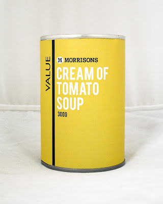
I have produced four more mock ups that experiment with the layout, scale and colour combinations of the product labeling.

There are things about each design that are right and wrong, so...

1. The size of the information to the right of the vertical line is too large. The spacing of this information is also wrong, it feels too squashed. The Morrisons logo and type is too big.

2. The Morrisons logo and type is too small, it doesn't register on the hierarchy. The spacing of the information is much better here, there is more space around each piece of text.

3. The Morrisons logo and type being at the bottom doesn't work - it looks like an after thought. The type is too big and makes the design feel unbalanced.

4. The Value here is just too big, it takes over the design too much. The Morrisons logo and type is a good size, and feels balanced with the rest of the information.

Overall -
  • The white elements register first in the hierarchy - therefore the product name and should be white, with the Value branding in yellow
  • The information needs space around it, so that it is readable and clear
  • The Value logo needs to be of a medium size, to balance the design
  • The Morrisons logo and text needs to be at the top of the product, and medium in size.
  • Design 2 is the best example of all of these elements - though the Morrisons logo is too small.

Sunday, 21 March 2010

Initial Postcard Ideas..

These are my initial ideas for the postcard design. At this point I'm not sure if I am going to tie the books to a particular retailer (like Waterstones). I think that as a design it would be better if it weren't specific to a retailer. These are a few ideas that show the type of things I am thinking of doing, but I'm not sure if I want to use a vector design, or photographs. I think that I will take a some new photographs and try using these within my postcard and poster designs.

Saturday, 20 March 2010

Bookmarks...

I have produced these 4 bookmarks as a complementing piece to the posters. I have produced 1 bookmark that shows all 3 covers that would be a pro-mo piece in store, and then an individual bookmark for each cover, that you would get when you buy the book.

I will develop these designs a little further so that they really tie in with the poster and postcard pro-mo designs. But, as a basic starting point for the bookmarks, I think that these are quite suitable.


Poster developments...

I have been experimenting with layout and colour to try and find a suitable poster style for advertising the books. I have come up with a basic style, and have tried to find a layout that has the books as a focus and type/information as a secondary, but strong element of the design.

I have experimented with creating an individual poster for each cover, and then a collective poster showing all three. I think that showing all three is a more suitable option for the in store advertising, whereas individual posters/banners would work well for a window display. So, I may end up using two different layouts of poster, using the same style of design (ie. type and colour combinations)


Thursday, 18 March 2010

Proposal Boards...

These are the three proposal boards that I am handing in to the marketing department tomorrow. I have shown both sides of the leaflet/poster and the invitation. I have also mocked-up the design for the email invitation and the web button for the college website. I have also included an idea for signage, outside and inside the college.

Layout and design...

I have experimented with the use of colour on the product labels.I want to find a good balance of using both of the brand colours, whilst keeping the design simple, effective and eye catching.

Experiments 1 - 4


These designs use the vertical line as a colour divider. This design manages to incorporate a good balance of the two brand colours and white, all of the designs feel quite equal. My preference out of the 4 designs is number 1 because:
  • The design uses more green than yellow, which I think is a less garish and extreme colour.
  • The white type stands out well against the green background.
  • The yellow background enables the Value text to stand out,
  • The white dividing line is strong between the two.
The white background areas do not work well - they make the design feel much cheaper, whereas the full colour backgrounds enhance the design.

My main issue with this design is that it reminds me of a clown (clowns wear suits that are two colours, divided down the middle). I know that might sound odd, but I find it off putting, and I think that there might just be a little too much going on within the design. (I also hate clowns). I think that something simpler, with less balanced amount of colour will work better. Which brings me onto...

Experiments 5 - 8


These designs are less mixed up and bold, but the designs are still effective and strong. The use of one background colour helps the vertical line to stand out better, and makes it a focus rather than a simple divider. I also think that the line being the same colour as the Value text enables those two elements to be seen as the branding for the range, rather than the line being a separate entity.

Design 7, where the branding and product name are in the same colour does not stand out as much as the other designs, where these elements contrast.

I feel that Design 8 is the strongest because;
  • The product name is first in the hierarchy, it stands out from the background, but doesn't have to compete too much with the branding.
  • The green background is subtle, but still bold and impacting.
  • The use of yellow is minimal, but still very much the focus as the colour of the product name.
  • The value branding is simple and clean, the white makes it stand out.
  • The smaller type - Morrisons logo and quantity are at the bottom of the hierarchy, but still very clear and effective.
I am going to pursue Design 8 from now on, as I think that this is the strongest option. I will experiment further with the exact layout of all the information and the balance of the design.

Tuesday, 16 March 2010

Laser Cutting

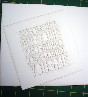
My intention was to laser cut one to the card designs I have done. I used the laser cutter today to test the design; though it it very crisp and clear, the laser leaves burn marks on the white card. These are the two test pieces:


Both of these designs were cut from the front - the design was the right side up. I have looked at the back of the design, and it is slightly cleaner than the front.

This is the back of the design - which might just about do for the mock-ups of the cards. I am going to try laser cutting the designs as a mirror image, and possibly try using black card, so that the burns won't show.