
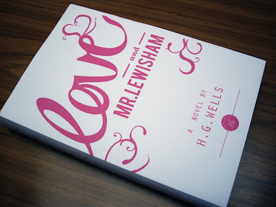
In the previous post I showed this colour way and was unsure how strong it would be when printed and covering the book. I have mocked up this title to get some idea of what the impact of the design will be.
I am quite pleased with the effect of the two colour design, but I think that the white design makes it look a little cheap. I think that using the black and colour is more impacting and creates a much stronger contrast.


No comments:
Post a Comment